Mapping party and leader image

Our image questions, when we ask the public which descriptions they feel fit each of the political parties or their leaders, are an important part of our armoury for understanding what they think about the election and why they vote as they do. But there is a problem: some leaders and some parties are much better known than others, and many more of the voters therefore have clear impressions of what they think about them; this means when we try to compare one leader or one party with another, simply comparing the numbers who apply each description can give a very misleading impression.
Take David Cameron and Ed Miliband. For almost all the positive descriptions in our poll, many more people feel they apply to Mr Cameron than to Mr Miliband. But Mr Cameron also gets more people applying the negative descriptions – it is simply that more people know what they think about the Prime Minister than about the Leader of the Opposition (and that’s almost always true, it is not unique to this year’s election).
Fortunately, there is a solution. Using a statistical technique called Correspondence Analysis, we are able to compensate for the public’s different levels of knowledge. This analysis produces an output in graphical form, an easily comprehensible and accessible visual format called a ‘perceptual map’.
Conceptually, a perceptual map is a diagram of “image space” based on differences between perceptions of the leaders or parties. It produces a picture of relative image – how the leaders are viewed by comparison with each other, and to which leader particular attributes are most strongly seen as applying or not applying. Because it compensates for the differing strengths of image of the leaders, and for differences in the applicability of various descriptions, it finds the most distinctive features even of a very weak image, and assigns even rarely chosen descriptions to those leaders that they are most nearly seen as fitting.
The perceptual maps from our most recent poll of leader and party image are shown below. (The ovals around each leader/party are not part of the statistical output but are added to aid the interpretation.) The party image map shows that each of the parties has a distinctive image, with a clear division between virtues of “head” and “heart”; the Conservatives put across an impression of competence, being “fit to govern” and having “a good team of leaders”, while Labour is more empathetic, seen as better at understanding the problems facing Britain and looking after the interests of people like me. Both apparently gain some credibility for tending to keep their promises, but this is only because the impression of their not doing so is weaker than for UKIP. This is a good illustration of the difference between this comparative measurement of party image and the absolute measurement taken from the bald figures, which shows that only a small minority trust the promises of any of the four parties: the public may distrust them all, but it is a less prominent part of their impression of the Conservatives or Labour than of UKIP, about which they know less.
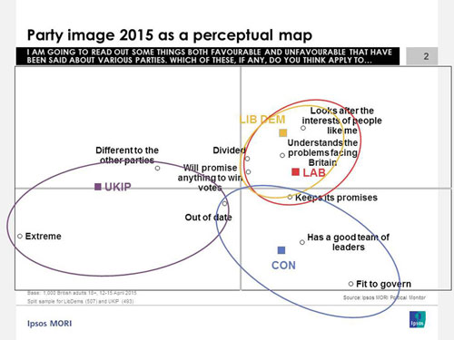
UKIP is distinctive in being seen as extreme, but also (which will be more to their liking) as being different from the other parties, although this impression is weaker (which the perceptual map shows by putting the “different to the other parties” marker nearer the centre). The descriptions closest to the centre – “divided”, “will promise anything to win votes” and “out of date” are those that distinguish least well between the parties, unfortunately because the public feel there is truth in all of them as applied to all four competitors.
The Liberal Democrats, intriguingly, are seen as being fairly similar to Labour. It may be difficult for one of those parties to win over more supporters of the other in this election, because the public see little to choose between them – unless they can come up with a distinction between the two that we didn’t measure in our poll. On the other hand, and this may be more important, on this evidence Labour and Liberal Democrats ought to find it very easy to vote tactically for each other in constituencies where that is relevant. And what does this imply for a post-election scenario if the Liberal Democrats get to choose between co-operation with a Conservative-led or a Labour-led government?
The perceptual map of leader image has obvious strong similarities with the party image map. The most fundamental distinction is between Nigel Farage and the others, although this time the dividing line is that Mr Farage is seen as the leader with “a lot of personality”, but with this also being interpreted as “more style than substance”. Fundamentally, however, it looks to be the same perception of being a mould-breaking outsider to the existing political establishment that characterises the image of his party. Mr Cameron, like his party, scores on competence issues, Mr Miliband on understanding the problems facing the voters (and Mr Cameron is seen as being the leader who is particularly out of touch). Mr Clegg is in the shadow of Mr Miliband just as the Liberal Democrat image is not strongly distinguished from the Labour one.
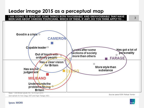
And, once more, we find some fairly important attributes so close to the origin that they are failing to distinguish between the competitors: if the voters want to vote for the leader who has the clearest vision for Britain, or who is least likely to look after the interests of some sections of society more than others, they are going to be stuck.