Ipsos Top Cities
On one level, the "Top Cities" survey is a simple one to report on. We asked three straightforward questions, of nationally representative samples in different countries around the world. Market research companies do this kind of poll every day.
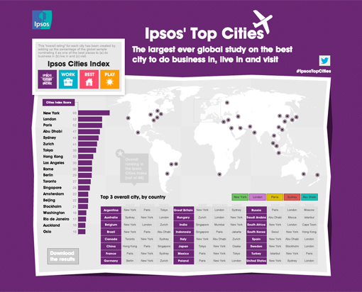
But it quickly became clear that we would need to spend some time thinking about how best to present the data. Although there were only three questions, they contained 48 answer options (i.e. the different cities). And each of these questions was asked in 24 countries. So we needed to have a simple way of summarising the key messages.
Because we were going to be releasing the survey internationally, we also needed to be able to show the results in a format that would enable people to be able to explore the findings that were of most interest to them. We didn't want it to be immediately clear that this piece of work was produced in London, with a "Britain-centric" way of presenting the findings.
Our first issue was overcome by the creation of the "Ipsos Cities Index". The building of an aggregate score for the three questions gave us the overall measure we needed to anchor the findings: New York in first place, Paris and London tied in second place.
Tom's interactive website solved our second issue. The map of the world gives us the canvas on which we can explore the different cities and see how well they did. We felt it was important to have a good level of granularity in the site: the results for each question (place to live, work, visit) are there for all cities, as are the results for younger people.
The other way to look at the data is to choose a country and see which cities are most popular among the population of that country. We did this via a summary PowerPoint deck which includes the Top 10 cities for each participating nation.
The collection of all our findings can be found here.

Designer's Note
by Tom Warren
This was the most ambitious digital project to date for me. An interactive visualisation is something I've been wanting to work on for a long time, ever since the emergence of infographics. The one thing holding me back has always been the coding element. I had been unable to find a developer capable of creating smooth animations using data, but with the introduction of Adobe's Creative Cloud and new programs such as Muse and Edge the gap between design and code is finally bridged! The need for me, as a designer, to create code is almost totally eliminated. I can do all my layouts visually and use a timeline, similar to After Effects or Final Cut Pro, to do the animations.
With this project in particular, as soon as I was briefed I wanted to use Adobe Edge to create the entire site. The nature of the project meant there needed to be various data points on view at one time, with the ability to switch between modes - work, rest and play, and to show and hide certain elements on demand. I began to realise that this was going to involve a lot of manual calculation. Each bar needed to be measured and animated individually. The highlights for the top 3 cities in each country needed to be positioned manually and the background swipe effect needed to be set up on the timeline so that no matter which area the user was in, the colour would swipe on top of the current background colour. All quite labour intensive, but the results are smooth and faultless.
What I loved about working in Adobe Edge was that I rarely got to a point where I couldn't work out how to achieve something I wanted to do. The controls and layout of the interface make it really intuitive to use, and the live preview meant I could test to see how compatible it was in various browsers. If I needed to add any bespoke code, a quick Google search brought up an excellent forum where other designers had already worked on the same thing, showing me that there is a slowly growing community of Edge users out there producing multi-platform interactive projects.
For any designers reading this who are thinking about learning Edge here's a great video of the first keynote Adobe gave, which shows how simple some of its functionality is to create.