National Highways and Transport Survey 2013 - DataFizz
Ipsos has been responsible for the delivery of the National Highways and Transport Survey (NHTS) for the past six years. At a time when local authorities (LAs) are coming under increasing pressure to deliver more for less, data on various aspects of local transport is particularly prescient. The severe winters of recent years added further strain to the deteriorating road network and while councils have worked hard to fill potholes, the Government committed a further £6bn to help local authorities repair the local road network in this year’s Budget. Meanwhile our survey data shows public ratings of road condition in decline; at the aggregate level, public dissatisfaction has increased for the sixth consecutive year.
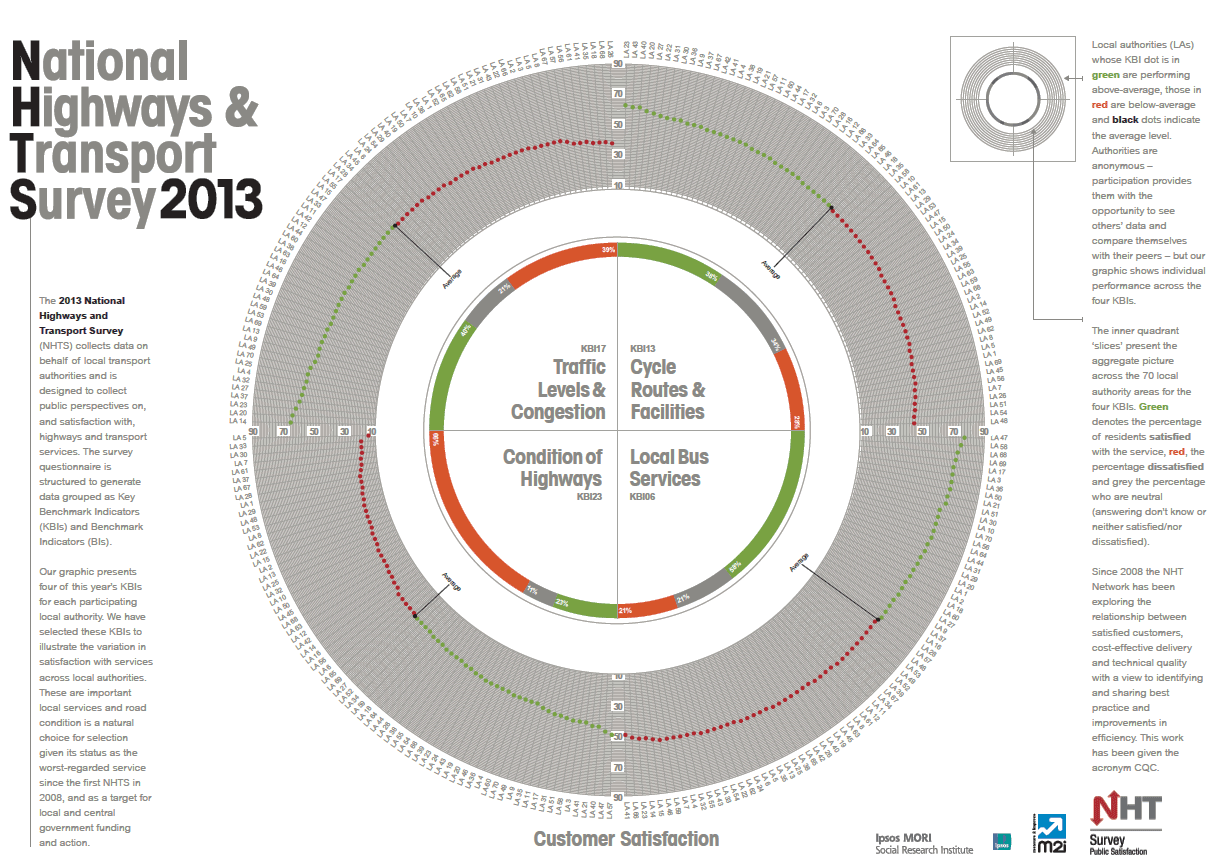
The NHTS dataset is a large one made up of, in effect, seventy surveys and the biggest challenge in designing the infographic was how best to display the true value of the survey - benchmarking seventy different local authorities - without creating something which proved overwhelming.
We decided to display data for four Key Benchmark Indicators (KBIs) which are generated from combinations of questions in the NHTS questionnaire, showing how LAs were performing against each other, as well as their performance comparison at the aggregate level. We chose the circular shape as a symbol of a wheel to tie in with the transport theme (we had experimented with various tyre treads but this didn't work out!)
We selected these KBIs as they are important local services which illustrate the variation in satisfaction across the different areas. Condition of highways is clearly the worst-regarded one; indeed it is now at its lowest level since the NHTS began in 2008. KBI06 – Local bus services is the best rated KBI with 58% at the aggregate level. The infographic contains two-hundred and eighty pieces of data (4 separate data points for seventy local authorities) as well as the aggregate satisfaction level in the inner circle.
The infographic aims to provide a snapshot of an extensive dataset on what are and will continue to be significant issues for the public and local authorities.